Press release
FHP Student creates new Design for Potsdam's Ice Cream Parlour "Eisfrau"

The local ice cream shop "Eisfrau" recently adopted a new look, which was designed by communication design student Birte Rauch. The design was created in a foundation course of the degree programme Communication Design at the Department of Design at the University of Applied Sciences Potsdam.
In the course "From sign to brand", under the direction of Prof. Matthias Beyrow, a customised rebranding was designed for the ice cream manufacturer "Eisfrau". The students developed various designs to create a holistic corporate identity that reflected the values and identity of the manufactory and had to be functional in terms of multimedia. The design had to appeal to customers of all ages and also convey a strong awareness of healthy ingredients and sustainable production. Birte Rauch's design was selected for realisation from the diverse designs submitted during the course.
About the selected design
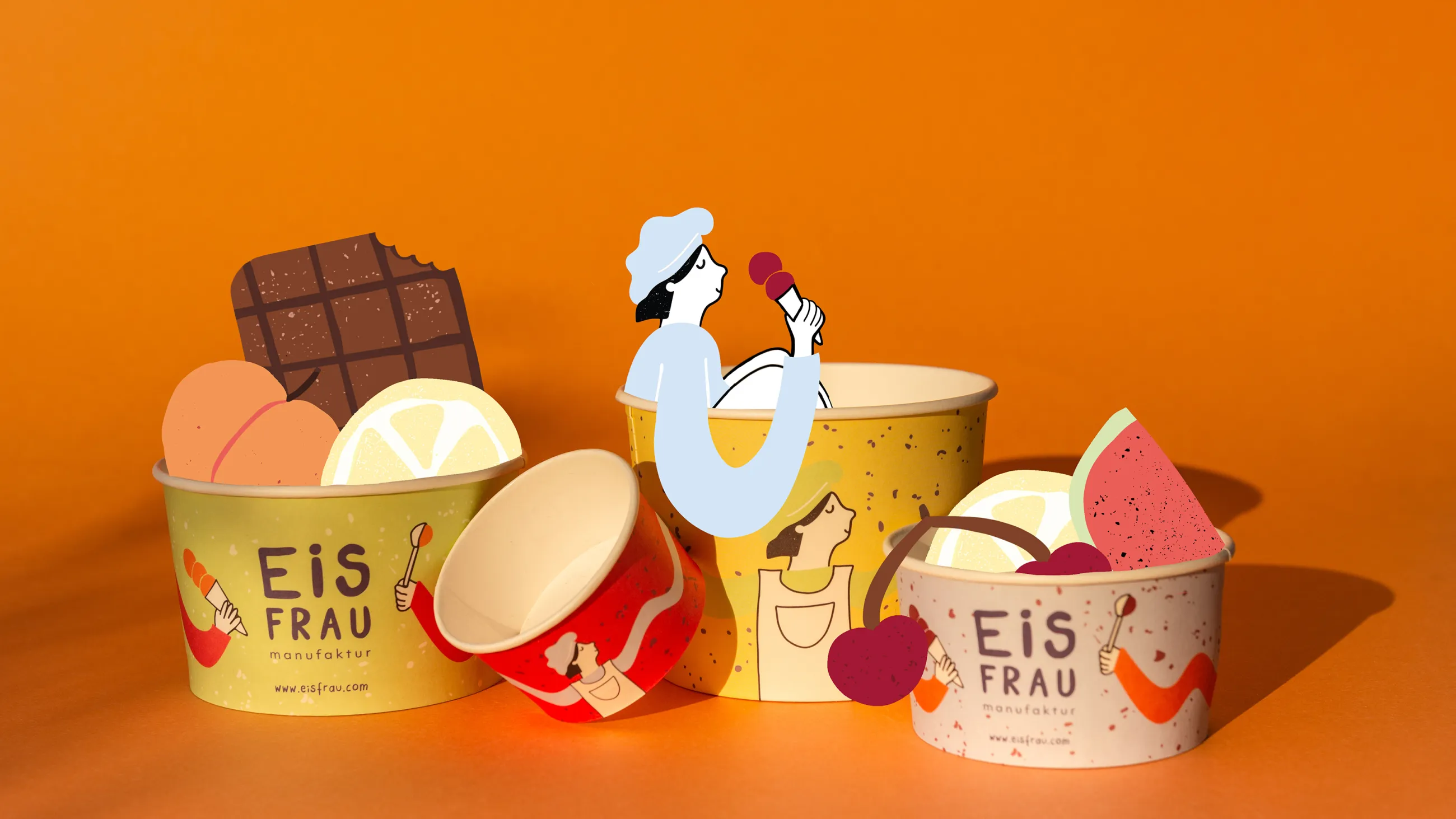
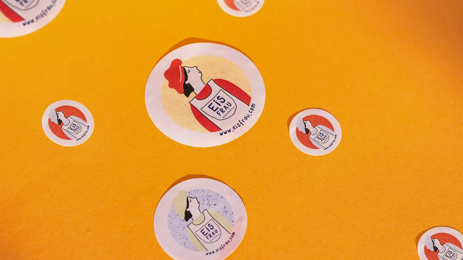
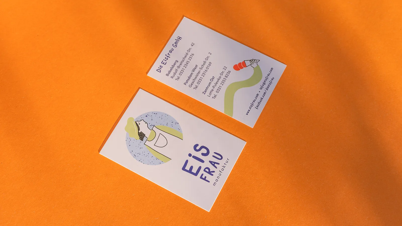
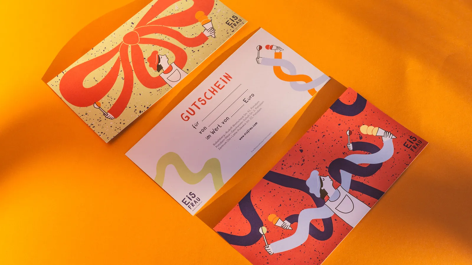
Personality, craftsmanship and passion are the basic ingredients of the new visual identity. In order to emphasise the uniqueness of the company, Birte Rauch established the "ice cream lady" as a popular figure. She was given an unmistakable face that radiates lightness and joy. The illustrative style of the design creates a clear unique selling point and brings joy – just like the ice cream.
The manufactory's new trademark has been reduced to a clear word mark that does not impose itself in combination with the illustrations. Thanks to its square basic shape, it is universal and can be used on a wide range of products. The specially designed corporate typeface emphasises the new corporate identity. It is reminiscent of handwritten blackboards and is the link between a traditional and modern atmosphere. The subline "Manufaktur" stands for craftsmanship and passion. The geometric, sans serif font provides a modern and mature counterweight. It creates a haven of peace and rounds off the overall image.
Lemon, pistachio, strawberry, sour cherry, hazelnut, mango, blackcurrant – the natural and cheerful colours are reminiscent of classic, down-to-earth ice cream flavours. Overall, the design impresses with a family-friendly layout.
Rebranding and realisation
The ice cream sundaes have been on sale for a few weeks now and the new logo on the shop windows invites you to eat ice cream. In addition, the business cards, stickers and a new coffee label are already in use. Vouchers have also been produced. The rest of the design will be implemented gradually. The ice cream parlour's new design has already been well received by customers. The owners of the ice cream shop are delighted with the student's work and how she has captured the identity and character of the shop.
The "Eisfrau" manufactory
Andrea Lisboa, who has been running the ice cream parlour together with her husband since 2015, is the woman behind "Eisfrau". Her aim was to make ice cream "the way you remember it from your childhood" , where you can see from the start what's inside and what it tastes like. Complicated ice cream flavours are not their thing, they want to make simple ice cream that tastes good and makes you happy. That's why they make artisan ice cream from scratch – the "ice cream lady" says: "Caramel starts with sugar, butter and cream and not with caramel". Regionality and quality are very important to Andrea Lisboa. With its three locations, the family business is a permanent fixture in Potsdam and a popular meeting place for local residents, families and tourists.
Contact
Birte Rauch
birte.rauch@fh-potsdam.de


